Tumblr App
Re-design
Brainstorming and Research
To kickstart the redesign, I conducted a thorough analysis of the existing app, identifying its strengths, weaknesses, and opportunities for improvement. Immersing myself in the user experience gave me valuable insights into pain points and potential enhancements. This analysis served as a foundation for generating initial ideas and guiding the subsequent design process.
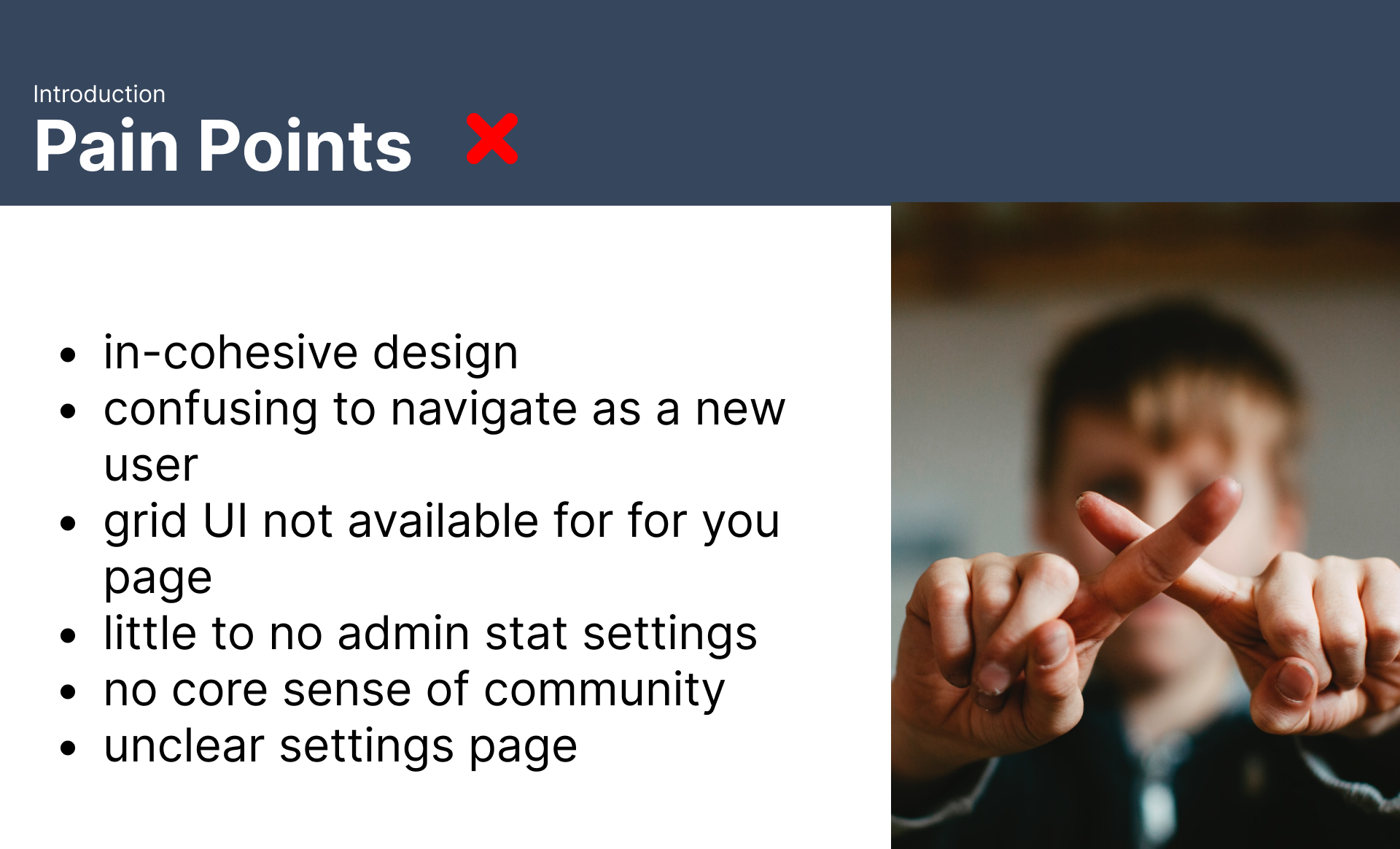
Pain Points
To gain a deeper understanding of user experiences, I delved into app store reviews and analyzed common user complaints. This process revealed several recurring pain points that I prioritized during my brainstorming sessions. By focusing on these specific challenges, I aimed to create a redesigned app that would address user frustrations and enhance overall satisfaction.
Competitive Analysis
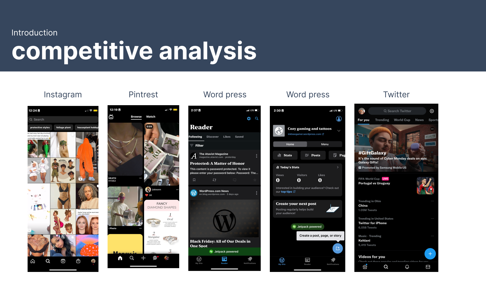
To benchmark the existing app and identify potential areas for improvement, I conducted a thorough competitive analysis of similar platforms, including Tumblr. By examining the features, user interfaces, and app store reviews of competitors, I gained valuable insights into industry trends and user expectations. This analysis allowed me to identify opportunities to differentiate the redesigned app and provide a superior user experience.
Personas
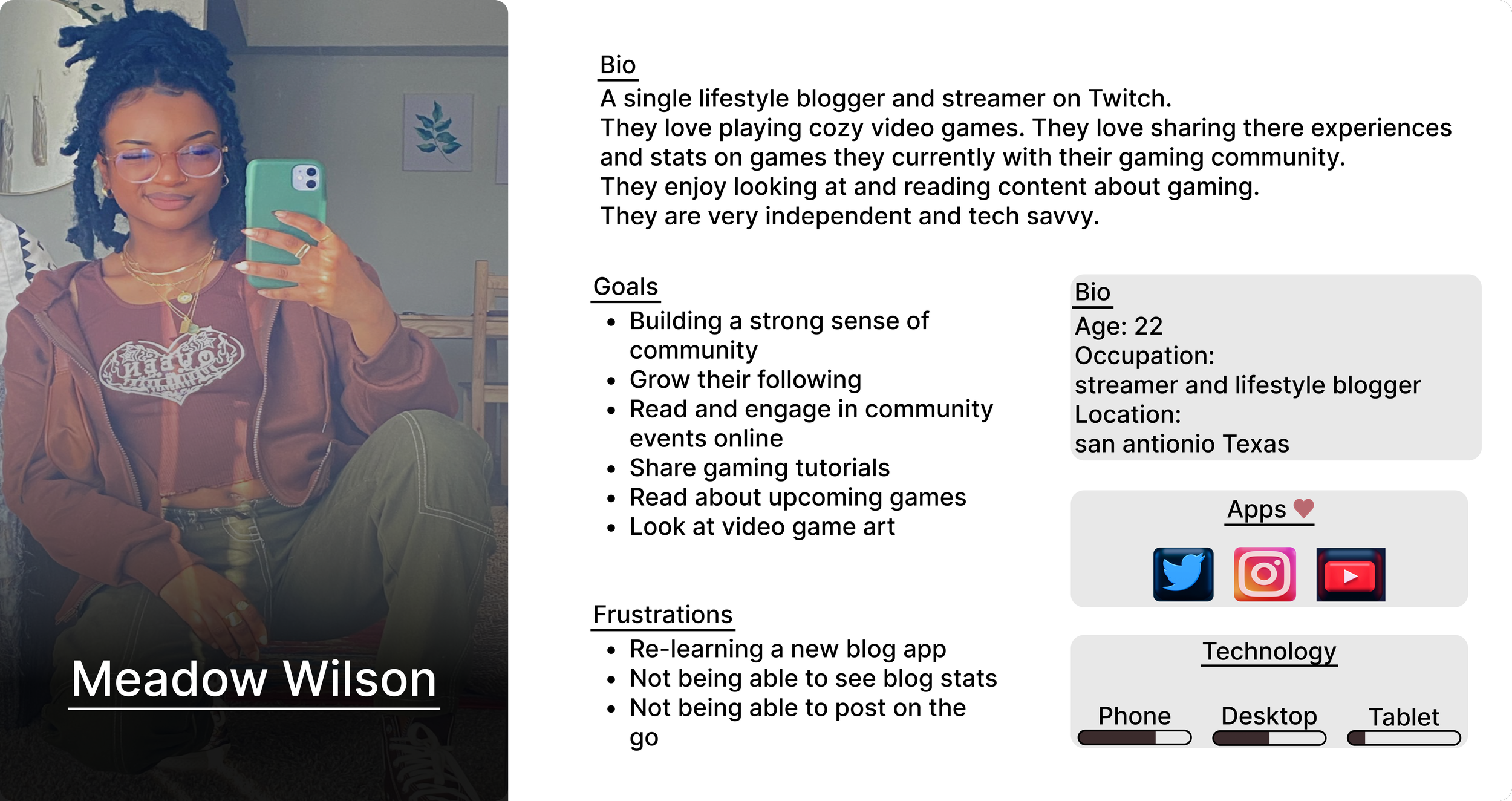
To better empathize with the target audience, I developed a detailed user persona. This fictional character embodied the key characteristics, motivations, and pain points of our typical user. By understanding the persona's goals and challenges, I could focus on designing solutions that directly addressed their needs and improved their overall experience within the app.
App Flow
To establish a clear and efficient user journey, I developed an iterative app flow. By continuously revisiting and refining the design based on user feedback and insights, I ensured that the flow aligned with user needs and expectations. While maintaining the core structure of Tumblr's existing flow, I strategically incorporated additional features to enhance the overall experience and address identified pain points. This approach allowed me to balance innovation with familiarity, providing users with a seamless transition to the redesigned app.
Low Fidelity
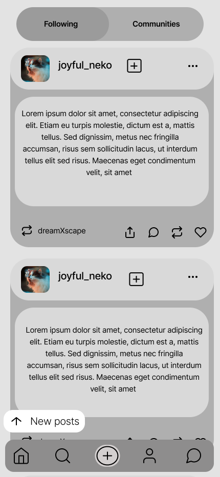
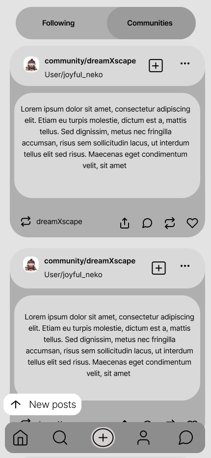
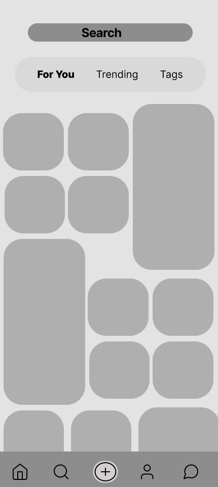
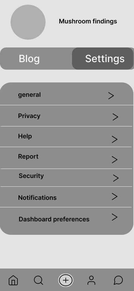
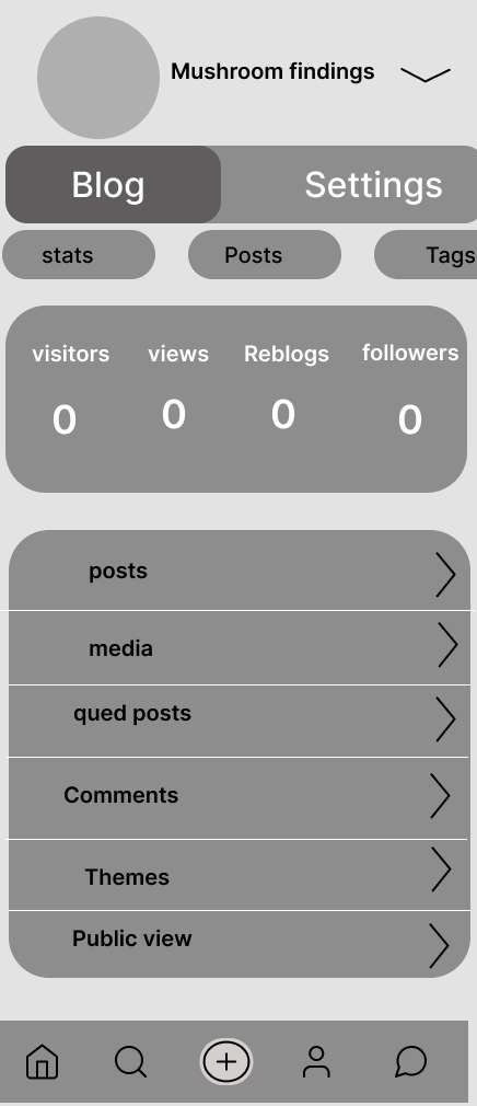
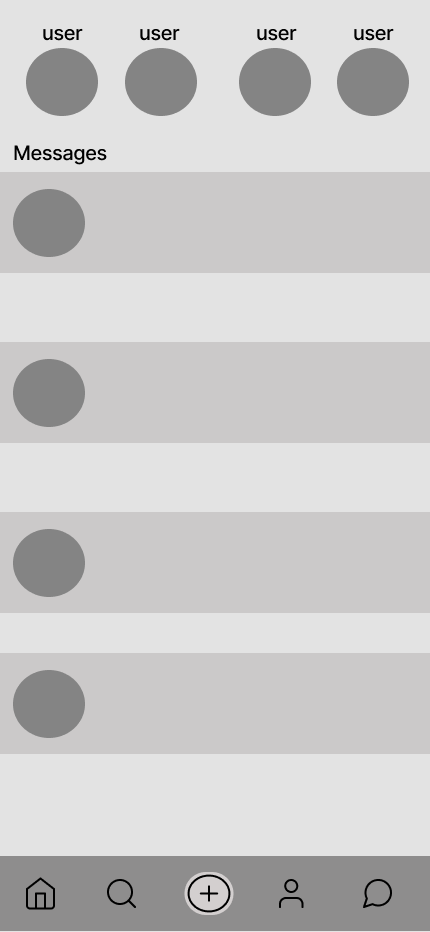
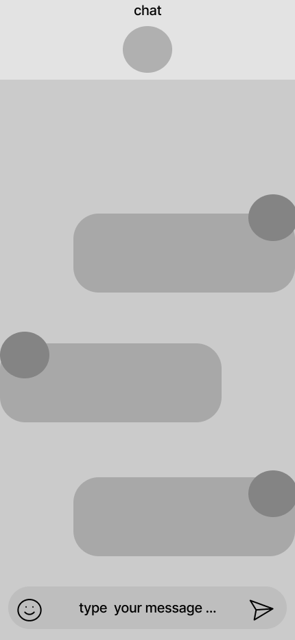
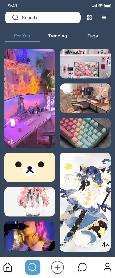
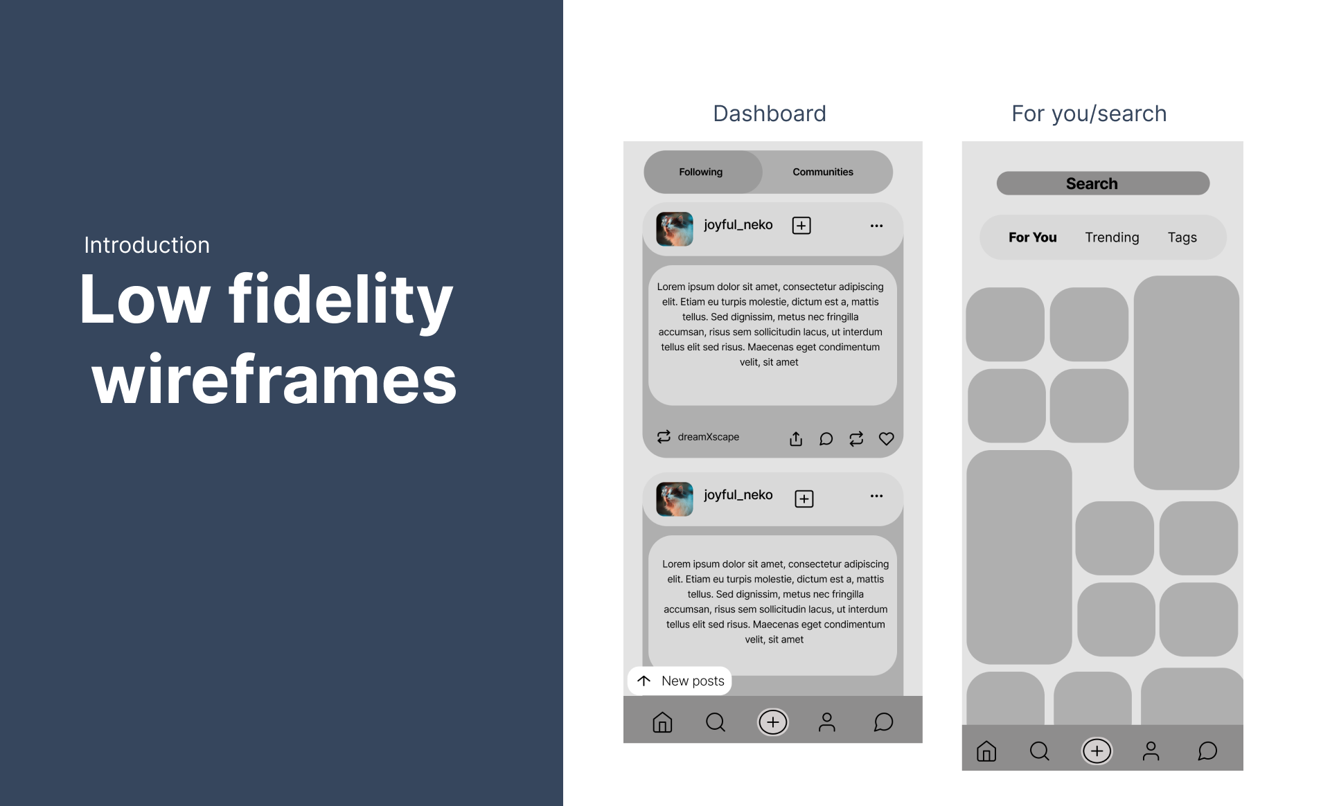
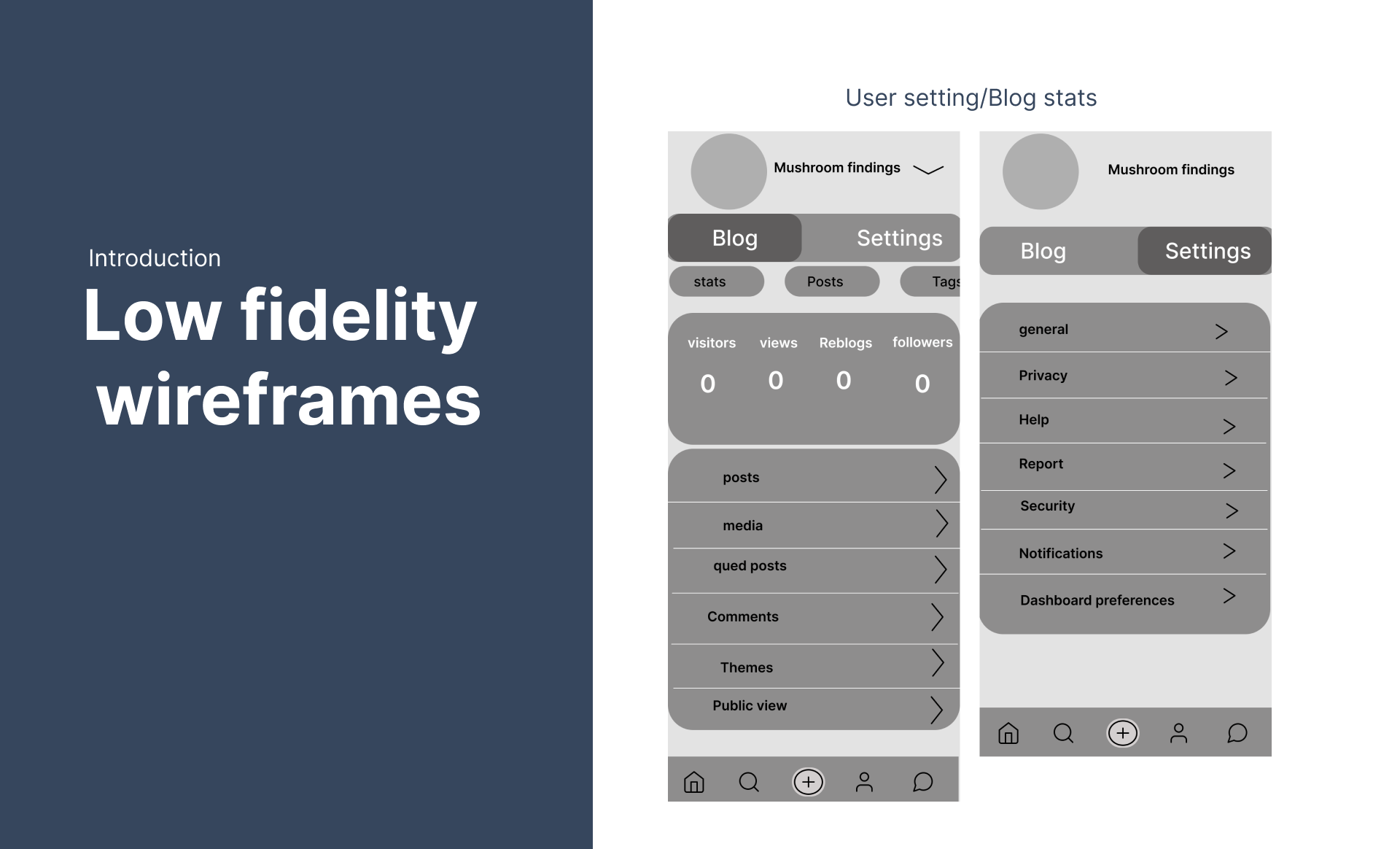
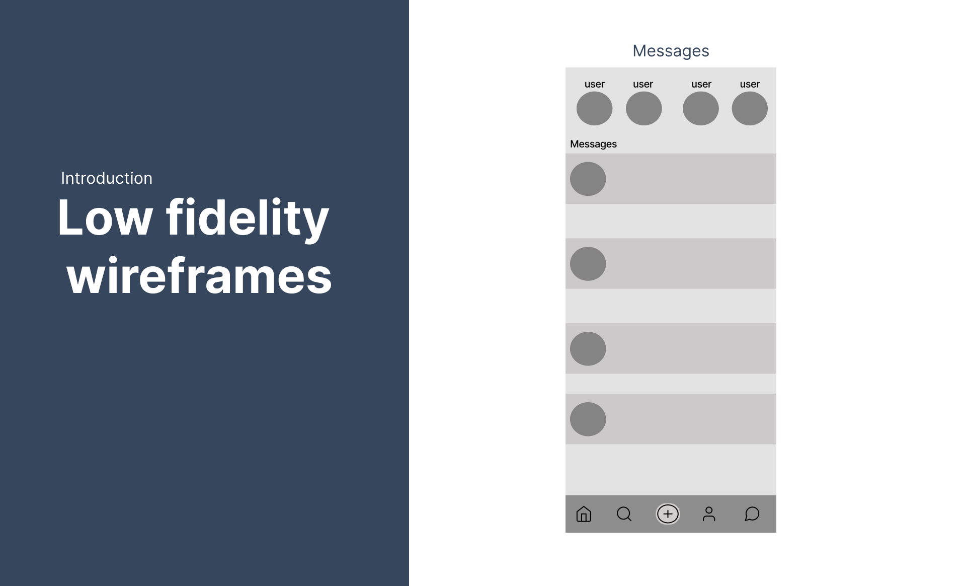
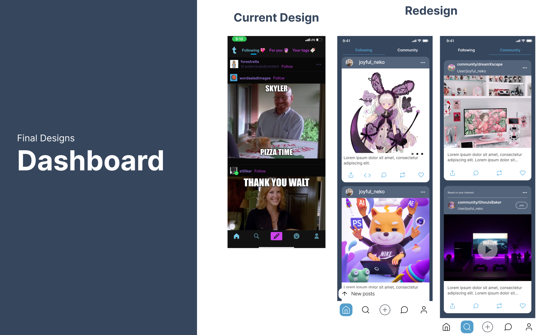
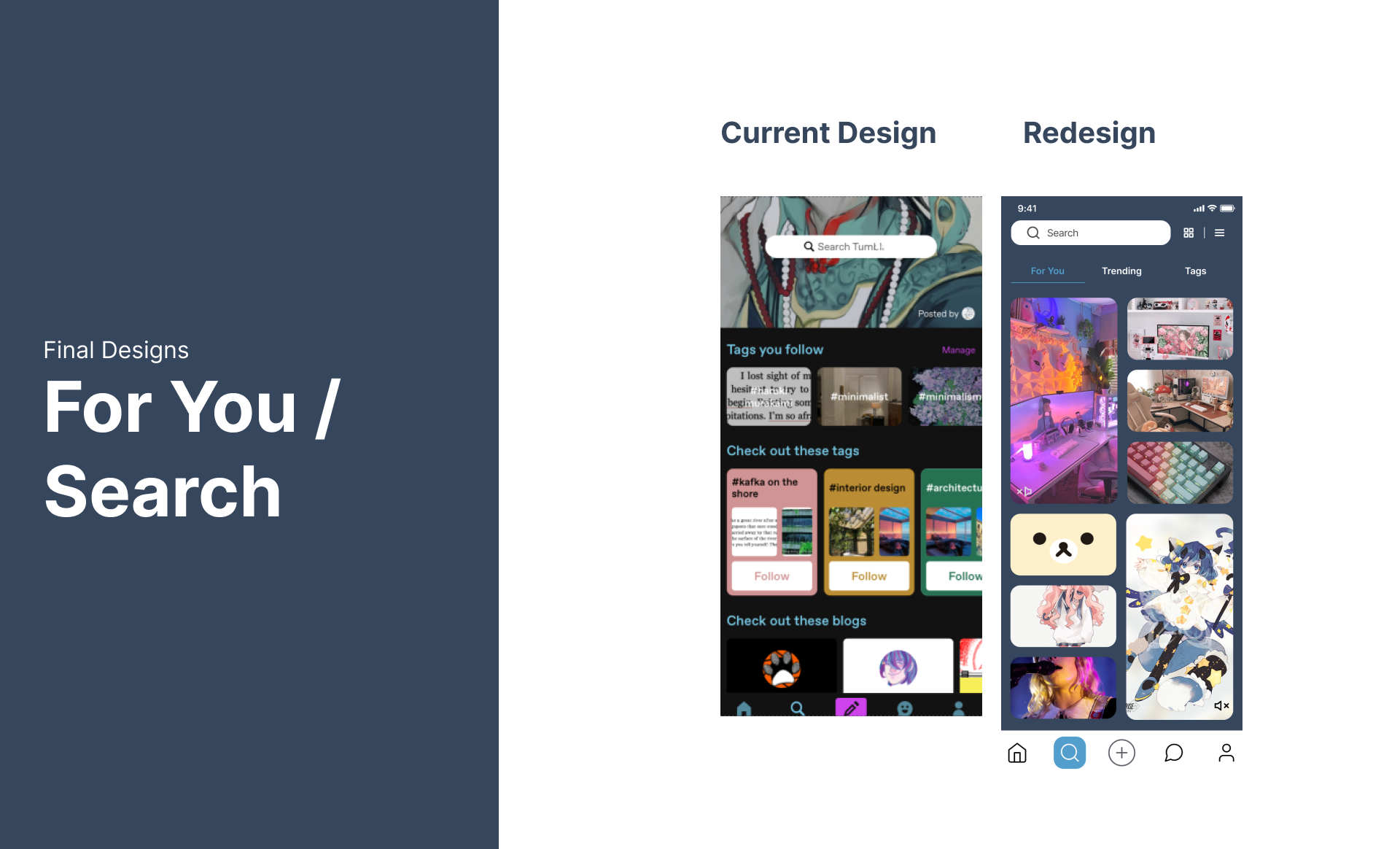
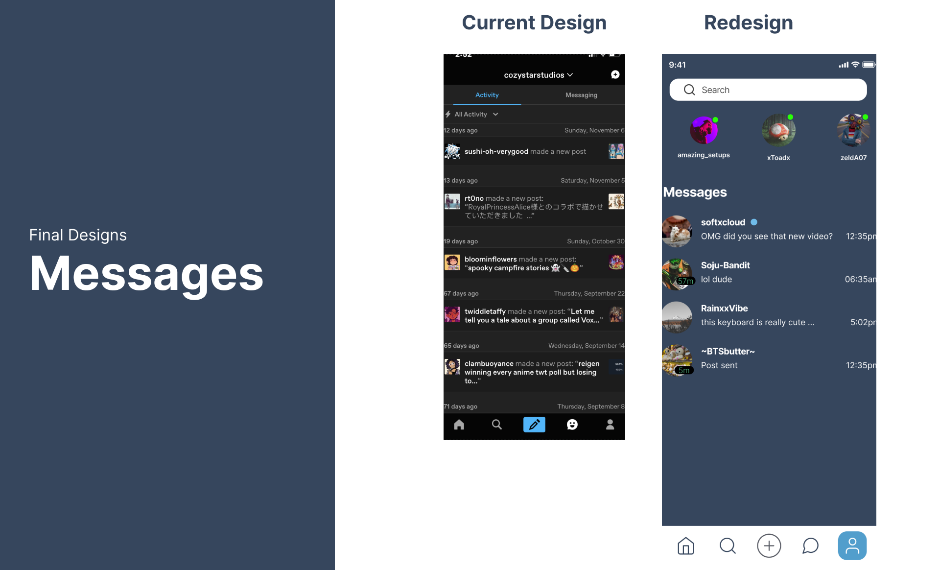
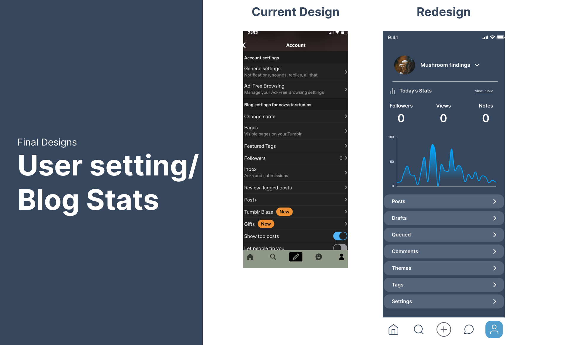
To establish a foundation for the redesigned app, I created low-fidelity wireframes that focused on key features such as the feed, community tab, and user settings. Inspired by Tumblr's competitors and user feedback, I aimed to create a visually appealing and intuitive interface. The wireframes incorporated a softer, more rounded aesthetic, contrasting with the app's previous design. Notably, I redesigned the "For You" page to resemble a grid-based layout similar to Pinterest and Instagram, but with a more organic and bubble-like feel. This approach aimed to enhance discoverability and engagement while maintaining a consistent aesthetic.
High Fidelity / Conclusion
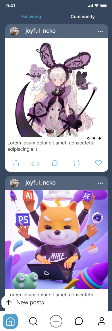
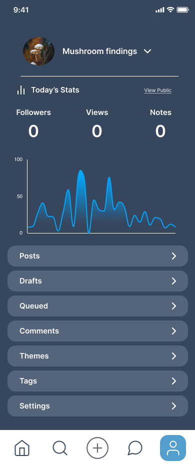
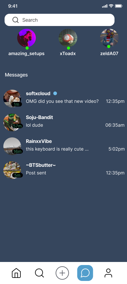
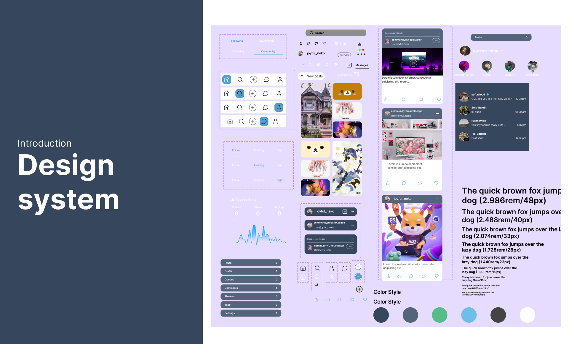
The high-fidelity design phase focused on refining the interface and ensuring consistency across components. While a mood board was unnecessary for this project, I created a comprehensive design system to streamline the development process and maintain a cohesive aesthetic. By addressing alignment issues and refining content blocks, I achieved a cleaner and more visually appealing layout. Additionally, I incorporated a blog analytics graph to provide users with valuable insights into their activity. Throughout this process, I gained a deeper understanding of the importance of grid systems, auto layout, and components in Figma, further honing my design skills.
Presentation
If you have any questions about my process please reach out!


