City Sounds
App Design
Brainstorming & Research
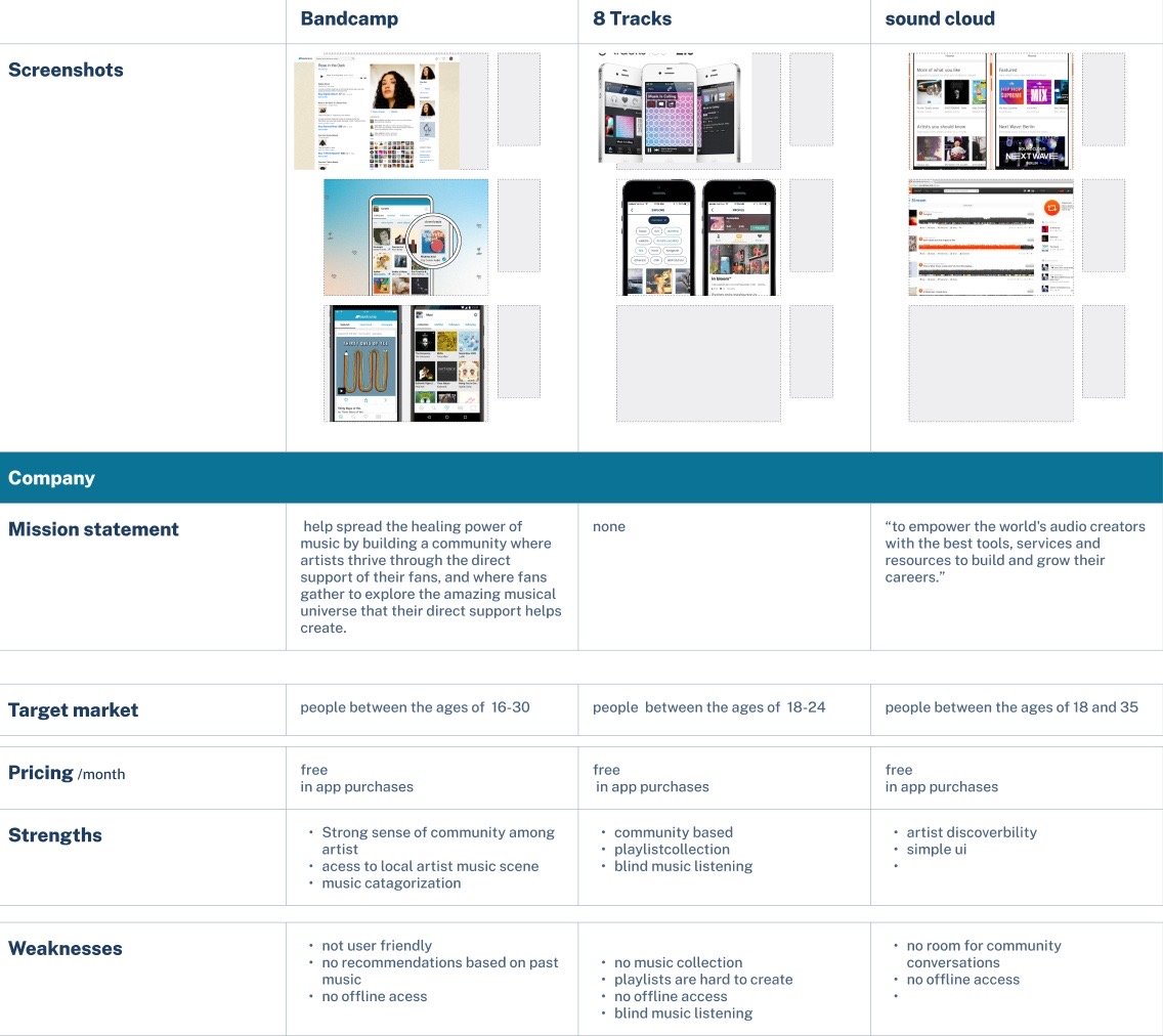
The research phase of UI/UX design is the process of gathering information about the users and their needs. This information is used to create a foundation for the design process and to ensure that the final product meets the needs of the users. In a comparative analysis, Ux designers compare a couple of different apps that are similar in genre. they compare features in the apps to each other. I compared music apps and the space to promote artists' events, where users are able to learn about events and or purchase tickets. The apps I chose to compare are Bandcamp, 8 Tracks, and Soundcloud. During this process, I went through all of their comments in the Apple app store to see what users’ pain points were and to see if there are more features that users might enjoy.
Persona
After looking at all of the comments created a persona from the issues that came up in the comments most often. The issue I came across was that users had trouble navigating the app’s interface and finding their favorite artist events and purchasing tickets. Navigation is one of the most important aspects of a user interface. If users can't find their way around, they're likely to get frustrated and abandon the product.
Mood Board
After Creating a persona and bringing a very real user issue to life. it was time to start creating mood boards and start putting my abstract ideas together to get the look and feel of what I might want the app to look or feel like. I came up with a mood board that helps reflect that. My one thought when making this mood board is how can I create the concert aesthetic throughout this mood board. The main tool that I used to create this mood board is Pinterest. I looked at the app designs that had a really interesting use of colors and artists in their element at their concerts. These pictures and photos help me put together the general aesthetic. My main two fonts are Graphik and Pacifico. I feel like they perfectly encompass the energy of nightlife. I decided to only use one button that would help create a sense of branding along with the color gradient. I actually created this color gradient by looking at some of the musician photos I found on Pinterest.
Low Fidelity Wireframes
Low-fidelity wireframes are typically created using simple shapes and text. Once I have some ideas, I can start to create a rough sketch of the user interface. This can be done on paper or using a wireframing tool. The wireframing process is an iterative process. This means that I need to go back and forth between the steps, making changes and improvements as I go. The goal is to create a user interface that is both usable and enjoyable to use. I wanted to make sure the users had a simple UI to navigate. Creating a functional UI for users to navigate was the main goal.
High Fidelity
High-fidelity design is the process of creating a detailed and realistic representation of a user interface. It is typically used in the later stages of the design process after low-fidelity wireframes and prototypes have been created. The goal of high-fidelity design is to create a design that is both visually appealing and functional. It should be easy for users to understand and use, and it should reflect the overall brand identity of the product or service.


